

02 / CASE STUDY
HEALTH COMMUNITIES
Digital Product Design / Healthcare
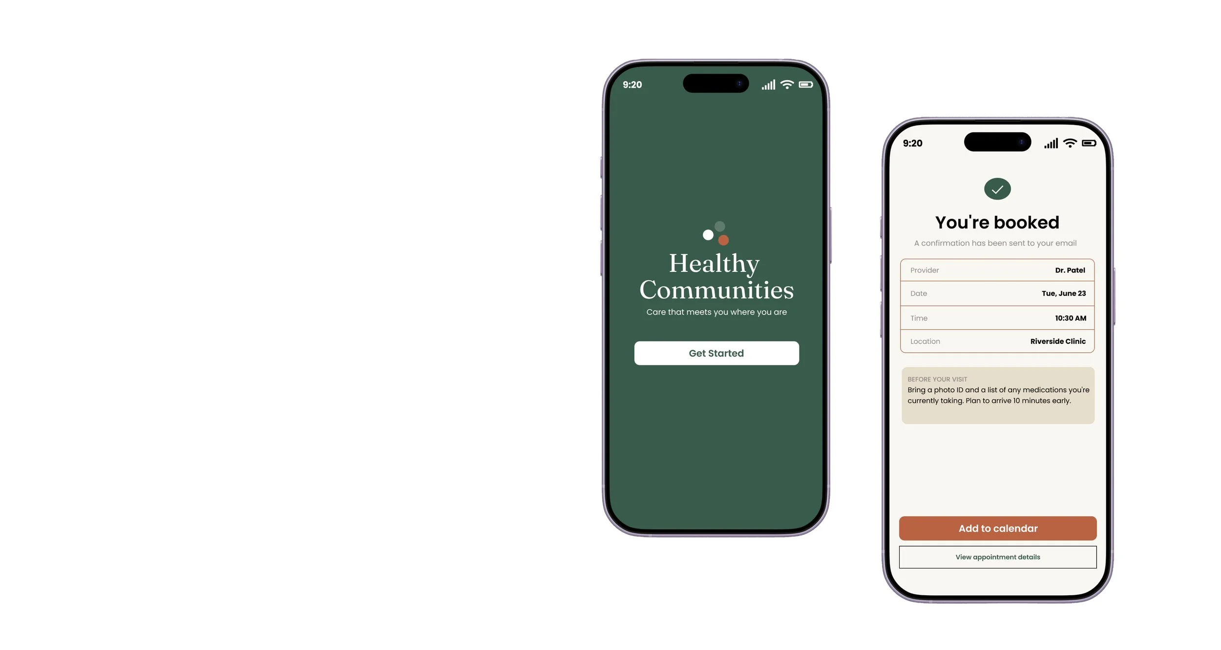
Healthy Communities is an independent healthcare product-design concept created to help individuals discover care, understand available health resources, and take the next appropriate step without unnecessary confusion.
The experience combines healthcare education, service discovery, appointment scheduling, and member support within a clear and accessible digital platform.
ROLE
Lead Product Designer
TIMELINE
Independent Concept
2026
INDUSTRY
Healthcare
PLATFORM
Responsive Web / Mobile Web / Conceptual Mobile App
DELIVERABLES
Product Strategy, User Flows, Wireframes, Responsive UI, Design System, Interactive Prototype, Campaign Support
The initial exploration focused on common barriers found in healthcare experiences:
Confusing terminology
Too many disconnected resources
Unclear next steps
Limited visibility into available services
Long or intimidating intake processes
Lack of reassurance during important decisions
These observations informed a product strategy centered on clarity, guidance, and progressive disclosure.
RESEARCH & DISCOVERY
Zocdoc
What works: Strong provider search, availability visibility, reviews, and direct appointment booking.
Opportunity: The experience can feel transaction-focused and does not always guide users who are unsure what type of care they need.
CVS Health / Aetna Member Experiences
What works: Connected access to insurance, pharmacy, care, and member resources.
Opportunity: Large healthcare ecosystems can feel complex, with multiple pathways and dense information.
Teladoc Health
What works: Clear access to virtual care and recognizable healthcare categories.
Opportunity: Create a warmer, more community-focused experience that connects education, care discovery, and local resources.
COMPETITOR ANALYSIS
The primary challenge was to create an experience that could communicate important healthcare information without overwhelming users.The platform needed to:
Make services easy to understand Help users identify the right type of care
Build trust through clear and supportive language Work across mobile and desktop devices
Support users with different levels of digital and health literacy
Make the path from information to action feel simple
THE CHALLENGE
BRANDING
COLOR
#2D5C4A
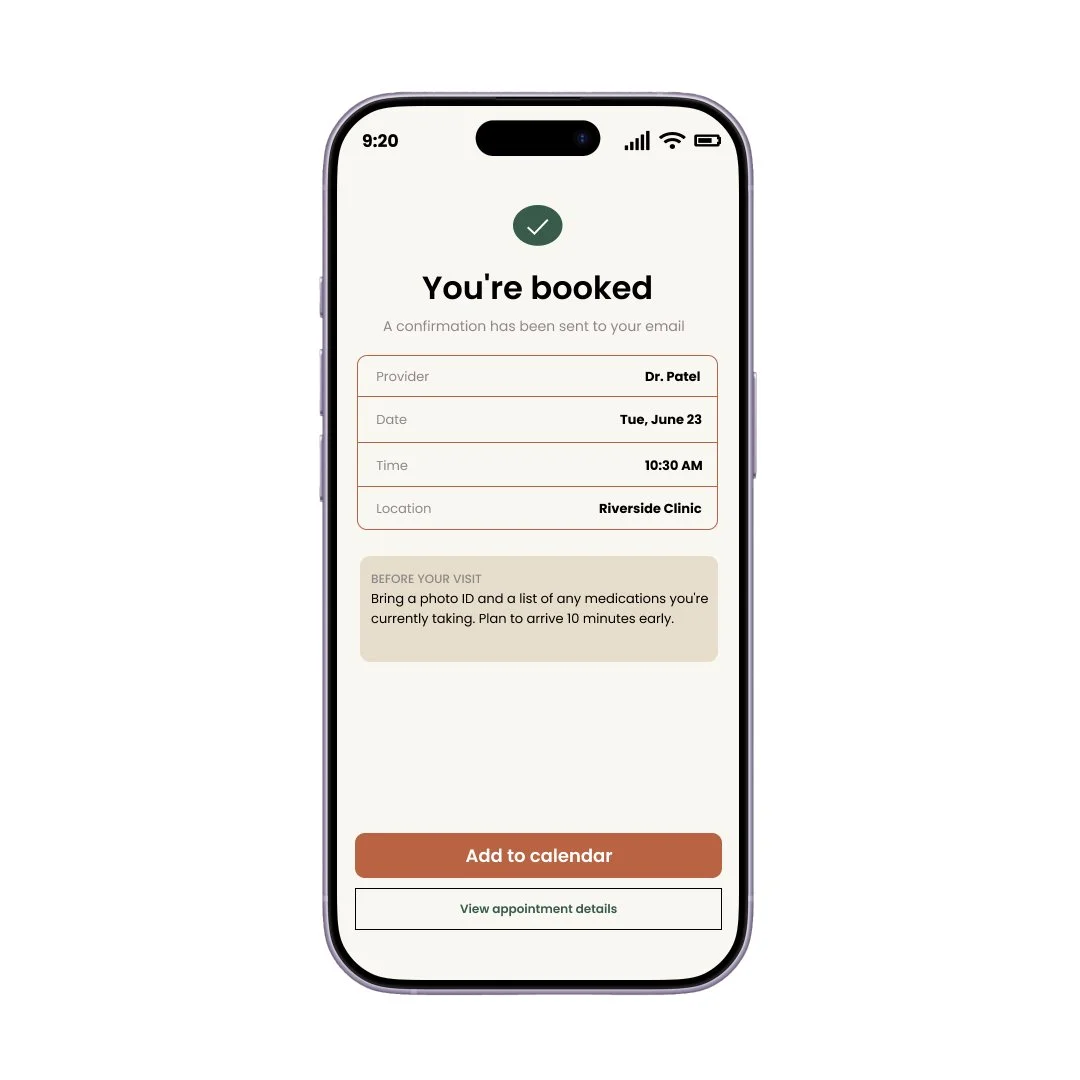
Pine for confirmation/success states (calm, grounded)
#C75D3A
Clay reserved only for the one primary action per screen (so it stays meaningful instead of decorative)
#E8DDC9
Sand for surfaces because pure white felt too sterile for the tone we wanted.
TYPOGRAPHY
Fraunces - Brings warmth and editorial trust without looking corporate-clinical.
Inter - Highly legible at small sizes — important for accessibility goal.
USER FLOW


LANDING PAGE
SELECT CARE NEED
The user arrives on the Healthy Communities homepage and begins exploring available care options.
The user selects a care category or answers a short guided question to identify the type of support they need.






The user compares provider profiles, specialties, insurance coverage, reviews, location, and appointment availability.
BROWSE OPTIONS & PROVIDERS
CHOOSE PROVIDER
The user reviews recommended services and providers based on their selected health need.
PROVIDE INFORMATION
SELECT DATE & TIME
The user enters basic patient information, insurance details, and the reason for the appointment.
The user reviews the appointment details and confirms that the information is accurate.
Return Experience
After booking, the user can return to the member dashboard to view, manage, reschedule, or cancel the appointment.
The user receives a booking confirmation, preparation instructions, reminders, and clear next steps.
The user chooses an available appointment date, time, and visit format.
APPOINTMENT CONFIRMED
REVIEW & CONFIRM
USER JOURNEY MAP
DISCOVERY
EXPLORATION
1.RECOGNIZE A NEED
2.EXPLORE OPTIONS
DECISION
BOOKING


“Which provider is right for me?”
“I want this process to be easy and quick.”
PREPARE
CONTINUED SUPPORT
“What should I bring or do beforehand?”
“How do I stay on track with my care?”


“Where do I start, and what type of care do I need?”
“What’s wrong, and who can help me?”
4.BOOK APPOINTMENT
3.COMPARE & DECIDE


6.ONGOING CARE
5.PREPARE & ATTEND
HIGH-FIDELITY PROTOTYPE
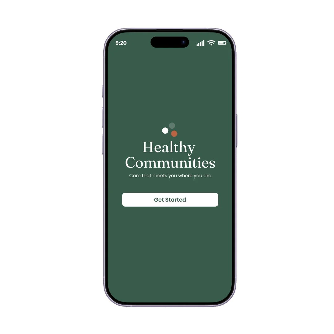
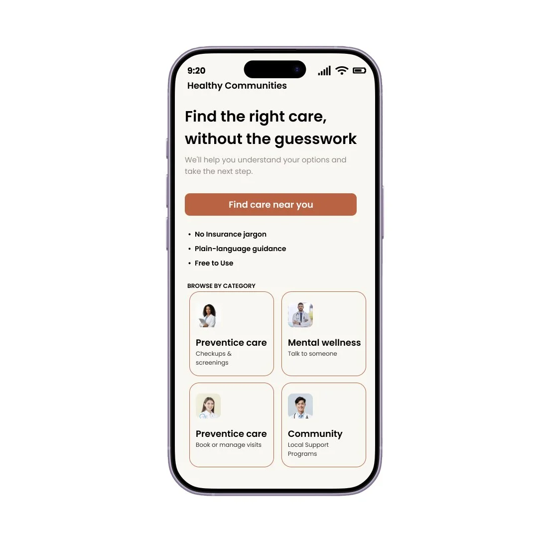
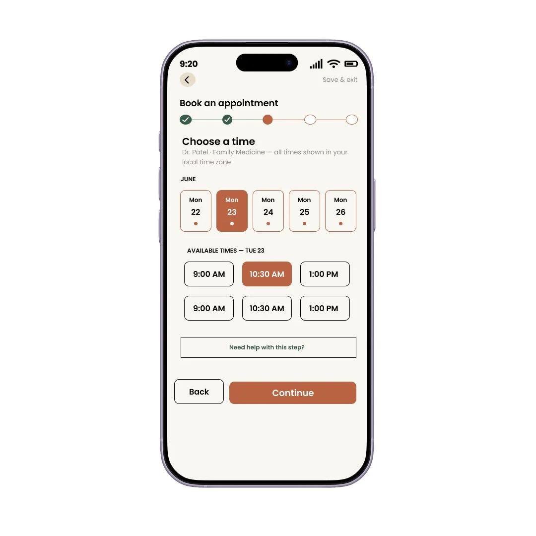
CARE DISCOVERY
Browse services by health need, life stage, or care category.
PROVIDER SEARCH
Review provider information, availability, specialties, and care options.
APPOINTMENT BOOKING
Move through a simplified scheduling process with visible progress and confirmation.
MEMBER HOME
View appointments, saved resources, recommendations, and care reminders.
HEALTH EDUCATION
Access clear, actionable content without unnecessary clinical complexity.
COMMUNITY RESOURCES
Connect users with local programs, events, and wellness support.
KEY FEATURES
The visual system was designed to feel warm, trustworthy, modern, and accessible. The interface uses:
Clear content hierarchy
Generous white space
Supportive imagery
Calm color usage
Simple iconography
Direct calls to action
Modular cards and reusable components
Mobile-first layouts
DESIGN APPROACH
Goal 01
SIMPLIFY CARE DISCOVERY
- Help members quickly identify relevant services, resources, and providers.
Goal 02
BUILD TRUST
- Use accessible language, inclusive imagery, and transparent information to create confidence.
Goal 03
SUPPORT ACTION
- Create clear pathways from education to appointment scheduling and follow-up support.
Goal 04
DESIGN FOR ACCESSIBILITY
- Build a system that considers readability, contrast, hierarchy, device responsiveness, and inclusive interaction patterns.
PROJECT GOALS
INTERACTIVE PROTOTYPE
Accessibility considerations included:
Strong color contrast
Readable type sizes
Clear focus states
Plain-language content
Large interaction targets
Descriptive labels
Consistent navigation
Reduced reliance on color alone
Responsive behavior across devices
ACCESSIBILITY
The experience is designed to:
Reduce confusion during care discovery
Increase confidence in healthcare decisions
Improve appointment completion
Increase engagement with preventive resources
Create a more consistent connection between public education and care access
INTENDED IMPACT
The next phase would include:
User testing with prospective members
Testing alternative appointment flows
Expanding error, empty, and loading states
Creating personalized member recommendations
Developing a full native mobile experience
Measuring conversion from education to scheduled care
NEXT STEPS
TOOLS AND AUTOMATION





CLAUDE
FIGMA
CHATGPT
ADOBE ILLUSTRATOR
ADOBE PHOTOSHOP